 Ron Domingue
Use the full lockup when there is enough horizontal room and the brand needs a clear first-read presence.
Brand System / 2026
Identity rules for the portfolio, field notes, case studies, and experimental interfaces. The system balances cinematic darkness, precise technical typography, and a controlled set of saturated signal colors.
Ron Domingue
Brand Logo
Ron Domingue
Use the full lockup when there is enough horizontal room and the brand needs a clear first-read presence.
Use the symbol alone for compact navigation, favicons, social avatars, loading states, and small persistent UI.
Keep clear space equal to the mark width around the logo. Minimum digital mark size is 24px.
Passport Emblem
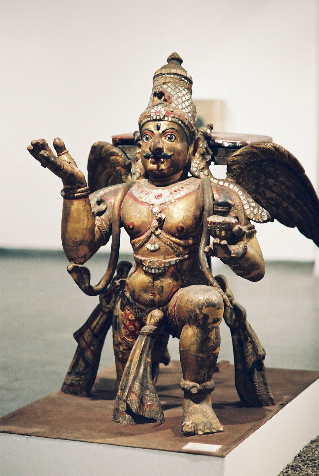 Garuda, Gilt Wood Sculpture
The mark is the Garuda, or Phra Khrut Pha — the emblem printed in a Thai passport and used as the official seal of the Thai monarchy and government. In Hindu mythology, Garuda is a divine being, half man and half eagle, the king of birds and the vahana, or mount, of the god Vishnu. Thai tradition adopted Garuda as a symbol of the monarchy itself, framing the king as an earthly extension of Vishnu's protection.
Garuda's defining trait is altitude: a vantage from above the tree line, high enough to read the whole terrain — sky against ground, signal against noise, the Naga moving in the underbrush below. That aerial read is the throughline into the work itself. Art direction, cinematic 3D, and systems design are all a practice of holding the wide shot before the close one: composing a world from above before dropping into any single frame, camera move, or interface.
Carried into a personal mark, Garuda reads less as a borrowed royal symbol and more as a working instruction — a fixed point back to a Thai passport and a lineage, translated into an eye trained to work at elevation: seeing the full system first, then the detail.
Type Setting
Use for hero titles, project names, section headers, and high-impact numerals.
Primary paragraphs use Barlow at 16-20px with relaxed line height. Keep body copy direct, visual, and grounded in the work.
Use for metadata, tags, labels, timestamps, measurements, technical captions, and UI telemetry.
Use these values for screen layouts. Scale type by role, not by decoration.
Homepage identity and major campaign covers.
Top-level page sections and case-study chapter titles.
Project cards, feature modules, and compact editorial headings.
Ron is a New Orleans-based art director and visual artist working across cinematic 3D, motion, fictional interfaces, and systems-driven design.
Use these values for PDF, booklet, and leave-behind layouts.
Print text should hold a calm measure with enough leading for image-heavy layouts, captions, and project context.
Printed pages should feel quiet, precise, and editorial. Use the brand colors as measured signals, not full-page decoration unless the spread is acting as a divider or cover.
Font Family
ABCDEFGHIJKLM
NOPQRSTUVWXYZ
0123456789
Loaded via Typekit. Used only at weight 300 for hero titles, section numerals, and large display type — never set bold.
ABCDEFGHIJKLM
NOPQRSTUVWXYZ
0123456789
Primary paragraph and UI typeface. Light for long-form copy, Regular for labels and controls, Medium for emphasis within text.
ABCDEFGHIJKLM
NOPQRSTUVWXYZ
0123456789
Fixed-width utility type for metadata, tags, timestamps, telemetry, and any label that should read as machine output.
font-family: 'din-2014', sans-serif;   /* display, weight 300 only */
font-family: 'Barlow', sans-serif;     /* body + UI, weights 300 / 400 / 500 */
font-family: 'Space Mono', monospace;  /* utility + metadata, weights 400 / 700 */
Color Scheme
Primary dark background.
Panels and elevated surfaces.
Primary highlight and active states.
Links, data, and secondary callouts.
Success, positive status, and live signals.
Warnings, emphasis, and temporal notes.
The site doesn't use flat grays for text — everything is the primary white at reduced opacity over Ink Black. The "light gray" on the homepage role line (Art Director / 3D Visual Artist) is white at 45% opacity, not a separate color.
Headings, primary UI, and body copy at full emphasis.
Eyebrow and role labels, e.g. "Art Director / 3D Visual Artist" on the homepage hero.
Secondary paragraphs, panel copy, and supporting description text.
Kickers, metadata, and the lowest-emphasis labels in the system.
Let black and graphite do the atmospheric work. Use magenta as the main signal, cyan for secondary readouts, and green or amber only when the content needs status meaning.
Interface Rules
Use compact metadata, strong imagery, and calm spacing. Avoid ornamental decoration that competes with the work.